Irrational Labs is a nonprofit that applies behavioral economics findings to product, marketing, and organizational design problems.
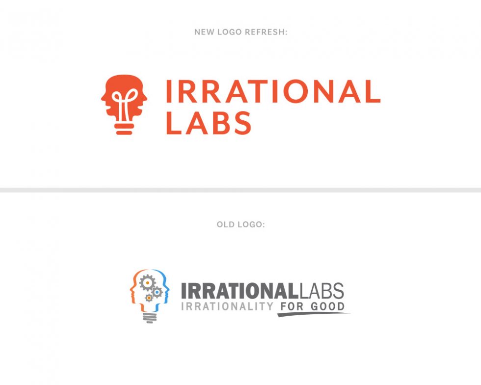
We did a logo ‘refresh’ for Irrational Labs. Their existing logo (shown here) was a bit outdated and quite busy. They wanted to keep the essence of the logo and general idea – so that was a big starting point for the redesign.
We simplified and modernized their logo greatly. We narrowed down the icon elements to the lightbulb and faces, which fit together in the shape well. The wire filament was added to make it more clear that it was a lightbulb, and also to be a subtle representation of ‘what’s going on in the mind’ (or human behavior).
Lastly, the logo is much more scalable now and can work at different sizes, colors, and formats. The icon is more clear and can be used easily across their marketing materials and social media platforms.
See also: Irrational Labs Website Design
