Avant is a Chicago startup that provides online personal loans.
We wanted to give Avant an identity that represented who they are – a young but trustworthy lender that is present for their customers when they need it. With this identity, we wanted to greatly separate them from the typical quick-cash places that often feel shady and amateur, and instead give them a look that felt safe and reliable.
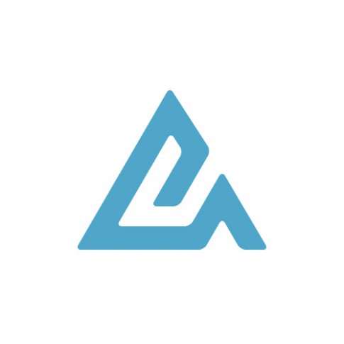
The triangle icon is meant to be an abstract representation of an “A” with a subtle and hidden “C” in the negative space of the shape. Their original name started as AvantCredit. Now that they have shortened their name to just Avant, the icon still represents them well as an abstract “A”. The line that forms the triangle shape is continuous and maze-like, while being simple and strong in it’s structure – which is a great reflection of Avant.


